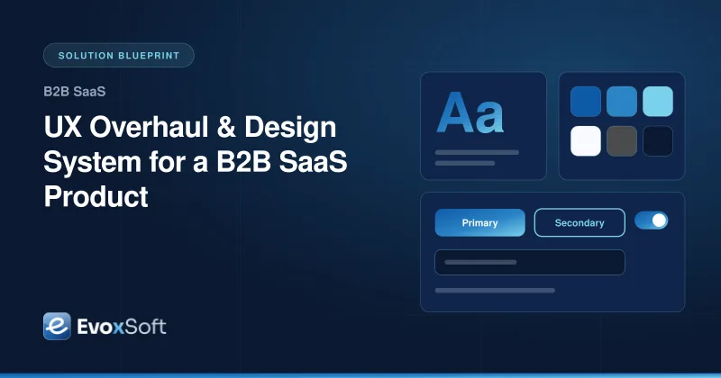
UX Overhaul & Design System for a B2B SaaS Product
A B2B SaaS product has grown feature by feature for years. Each screen looks slightly different, new users struggle with core workflows and enterprise buyers are asking about accessibility. This blueprint shows how we pair UX research with a tokenized design system so the product becomes easier to use and faster to build.
Screens built by different teams use different patterns, so users relearn the interface in every module.
Designers and engineers keep separate versions of colors, spacing and components that drift apart.
Enterprise procurement asks for accessibility conformance, and the product has never been audited.
A full redesign would freeze feature work, which the business cannot afford.
What the Solution Delivers
Core workflows redesigned around research findings and validated with real users
One set of design tokens that updates Figma and code together
A documented, versioned React component library that product teams install like any package
Components built and tested to WCAG 2.2 AA, with accessibility checks in every pull request
Architecture
Design-to-code pipeline
Research findings shape Figma components and tokens. Tokens are exported to code, compiled into the React component library and published as a versioned package that each product app adopts at its own pace.
The situation
B2B SaaS products tend to grow one feature at a time. After a few years there are several table styles, three kinds of modal and a settings area that nobody wants to touch. New customers need long onboarding calls, support tickets point to the same confusing screens, and enterprise buyers send accessibility questionnaires the team cannot answer. Designers keep a Figma file that no longer matches production, and engineers rebuild the same button in every new module.
Our approach
1. Start with research, not pixels
We interview customers across roles, review support tickets and analytics, and run moderated usability tests on the workflows that matter most, such as setting up an account, building a report or approving a request. The goal is a short, ranked list of problems backed by evidence, so redesign effort goes where users actually struggle.
2. Audit the product as it is
Our designers run a heuristic UX audit and an inventory of every UI pattern in production: buttons, inputs, tables, filters, empty states and error messages. An accessibility specialist tests key flows with keyboard navigation and screen readers against WCAG 2.2 AA, including focus visibility, target size and accessible authentication. The inventory usually shows that a few dozen components cover most screens, which sets the scope of the system.
3. Define tokens once and sync them to code
We build the Figma library on a token foundation: color, typography, spacing, radius, elevation and motion, with semantic names like surface-muted or text-danger rather than raw values. Tokens Studio stores them as JSON in the same Git repository as the code. Style Dictionary compiles them into CSS custom properties and TypeScript constants, so a change approved in Figma reaches code through a normal pull request. Light and dark themes, and brand themes for white-label customers, come from the same source.
4. Build a component library engineers want to use
Components are written in React and TypeScript on top of accessible primitives such as Radix UI, so keyboard handling and ARIA behavior are correct by default. Each component ships with Storybook documentation, usage guidance and interactive examples. Chromatic catches visual regressions, and axe-core and Playwright tests run on every pull request. The library is versioned with Changesets and published to a private npm registry, with clear release notes and migration guides.
5. Redesign the key workflows on the new system
With the foundation in place, we redesign the workflows ranked highest by research, prototype them in Figma and validate them with users before engineering starts. Those screens become the first production consumers of the library and prove it works under real conditions. We track task completion and support ticket themes before and after each release, so the team can see whether the changes are helping and adjust the next round of work. Findings that point to missing components or unclear guidance feed back into the system itself.
How we deliver it
We roll out in phases so feature work never stops. New features are built system-first, existing screens migrate module by module, and a compatibility layer lets old and new styles live side by side during the transition. We set up a small contribution process so product teams can propose new components instead of building one-off versions. Lint rules flag hard-coded colors and deprecated components, and a simple adoption report shows how much of each app runs on the system, which helps teams plan the remaining migration. Our web and mobile app development engineers work alongside your team so the system is owned internally when we step back.
Is this relevant to you?
If your product feels inconsistent, design and code have drifted apart, or accessibility questions are slowing enterprise deals, this approach is a good fit. Explore our UI/UX design service or talk to us about your product.
Building something similar?
We'll walk through your requirements and share how we'd approach architecture, timeline and team for your project.
We use essential technologies to run this site. With your OK, we also use cookieless analytics and Google Maps, which may set cookies. No ads, and we never sell your data. Cookie Policy
Privacy preferences
Choose which optional technologies we may use. Strictly necessary ones are always on because the site can’t work securely without them. Details are in our Cookie Policy.
Your browser sends a Global Privacy Control signal, so optional technologies are off by default.
Strictly necessary
Security and spam protection (Cloudflare, Google reCAPTCHA), form delivery, and remembering these choices.
Always on
Cloudflare Web Analytics counts page views without cookies or cross-site tracking.
Shows our office on Google Maps. Google may set cookies and receive your IP address.